


Italian Street Kitchen is a Italian restaurant brand aimed at primarily young professionals late 20s-early 40s. They offer authentic but modern take on Italian cuisines that honours Italian culinary traditions but is not afraid to take risks on innovating new flavours.
The old look of the brand was based on water colour and has a soft, nostalgic, handmade feel that depicts modern italian cafe / food culture. We wanted to keep this vibe but update it for 2025.
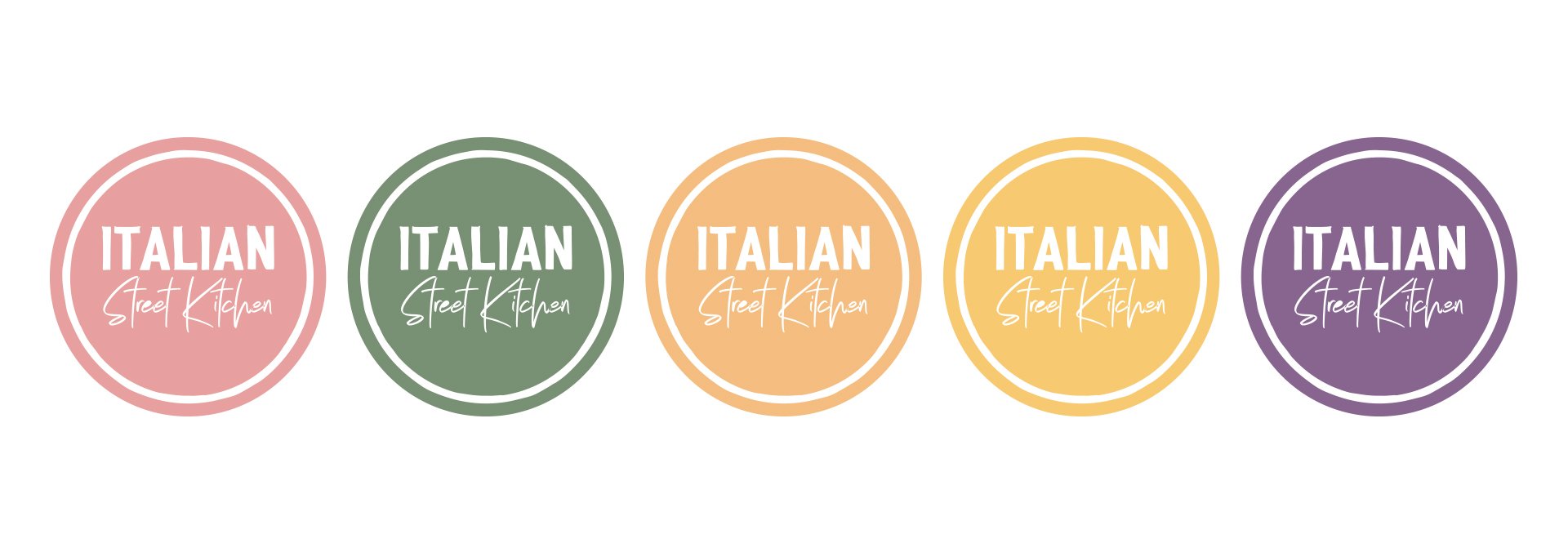
The owners did not want to change the logo dramatically so we just updated the colours to be fresh and fun. There are lighter colours as well as darker ones so we can swap for summer/winter
I led the team in creating a new brand style guide that modernised the brand while still keeping the artisanal, homemade and friendly quality that is so essential to the brand
I designed a series of illustration for both packaging and instore that is based on lino print depicting modern italian lifestyle
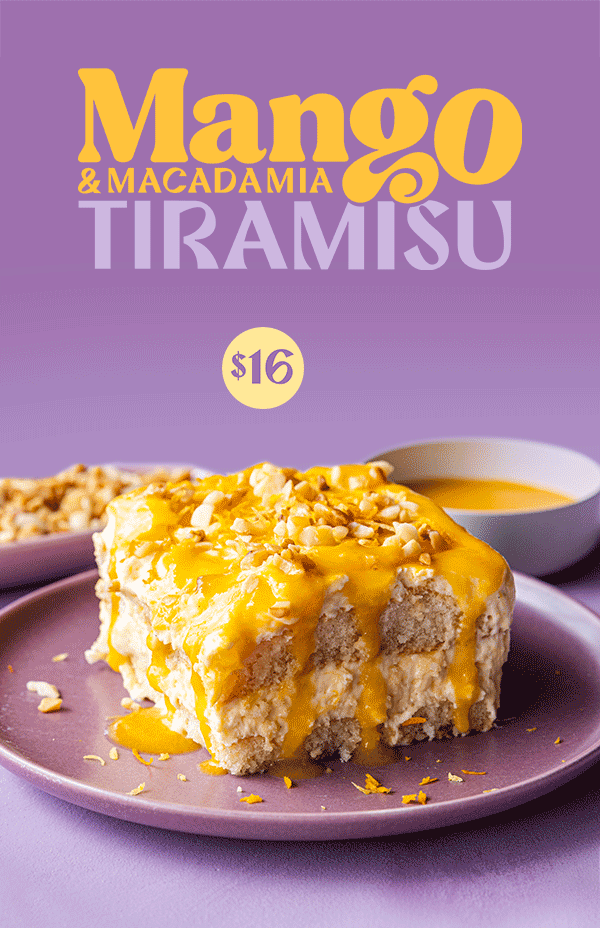
This playful illustration style is carried through to all sorts of applications such as in store posters and promotions
LImited time offers and socials capitalises on playful colours and typography