
Project name: Growing Hearts Podcast Brand Refresh.
Client: Growing Hearts Podcast.
Deliverables: Refreshed brand package, podcast artwork and Canva templates.
The Challenge: Revitalise the Growing Hearts Podcast brand to better align with its target audience (parents aged 30+, families who are looking for authentic voices), informed by market research. Exercise restraint to ensure the brand does not stray too far from its original voice. Develop Canva templates to support consistent, cohesive social media tiles.
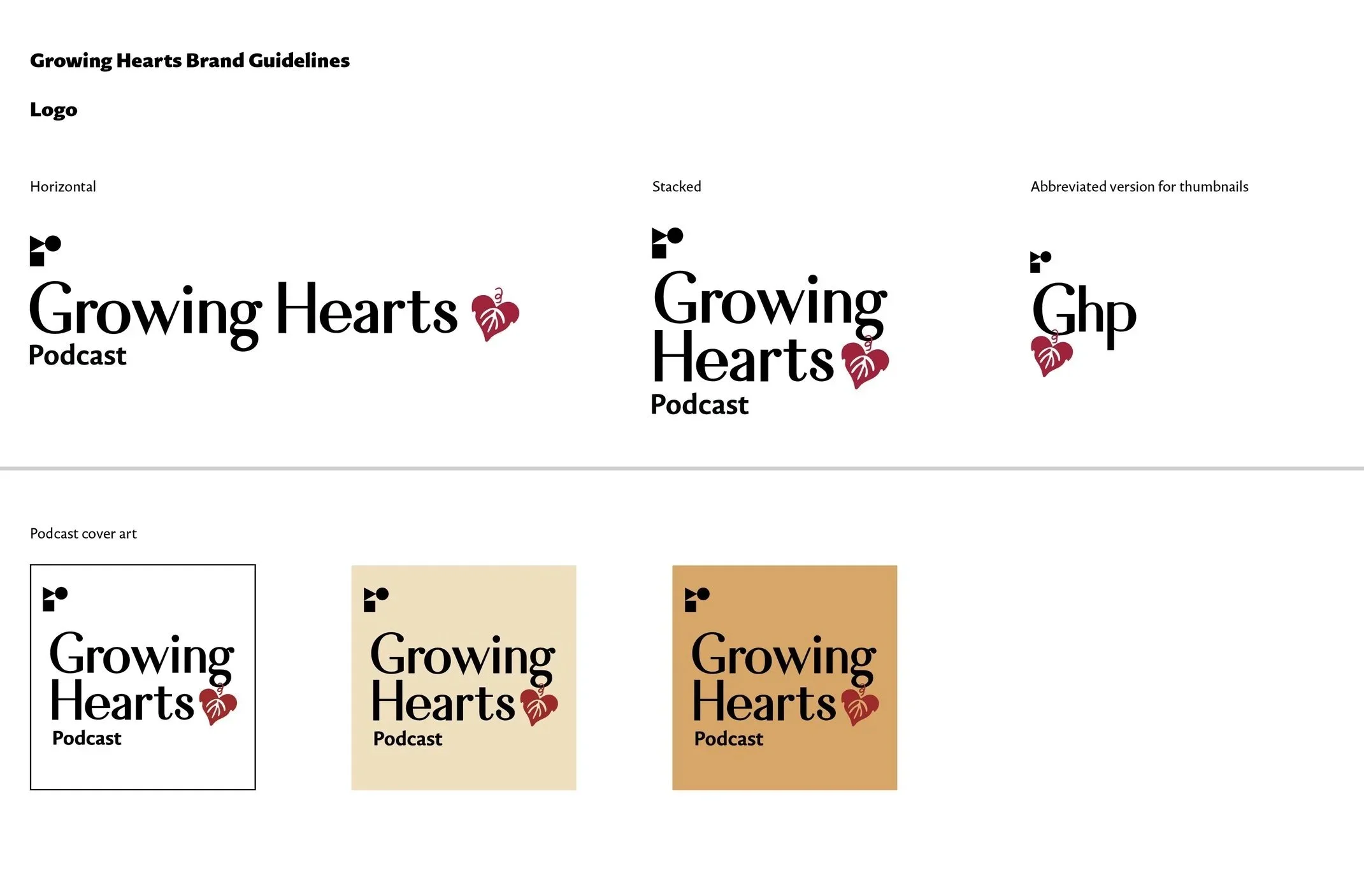
Final Logo
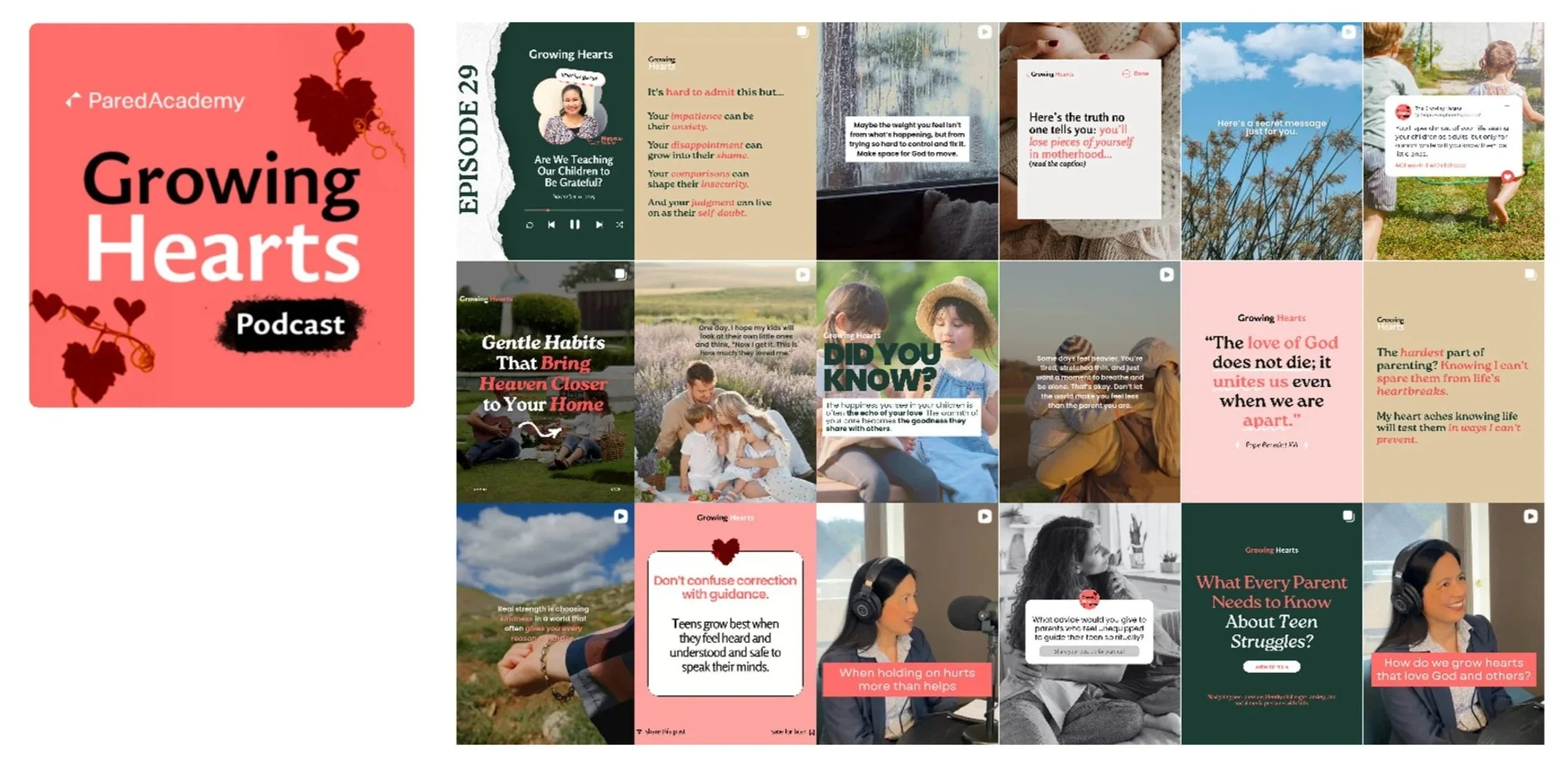
Old branding
The existing branding was still largely effective; however, there were visibility issues with the heart and vine illustrations. These elements did not scale well and became difficult to read at smaller sizes. While this posed practical challenges, the Christian symbolism of the vine is integral to the brand and needed to be retained in the refreshed identity. Additionally, the absence of a clear system or guidelines for social tile design resulted in a grid that lacked overall cohesion. The team would also revise the colour pallette to make sure it is more gender neutral and inclusive.
Final Design
I began by simplifying the heart and vine motif into a scalable graphic symbol. The typography was updated, and an abbreviated logo version was created to ensure legibility at small sizes, such as thumbnails. Then I created a visual systems and Canva templates so that by adhering to the system and guidelines, brand consistency in language and visuals will be achieved. I also developed a new colour palette that communicates warmth and calmness.
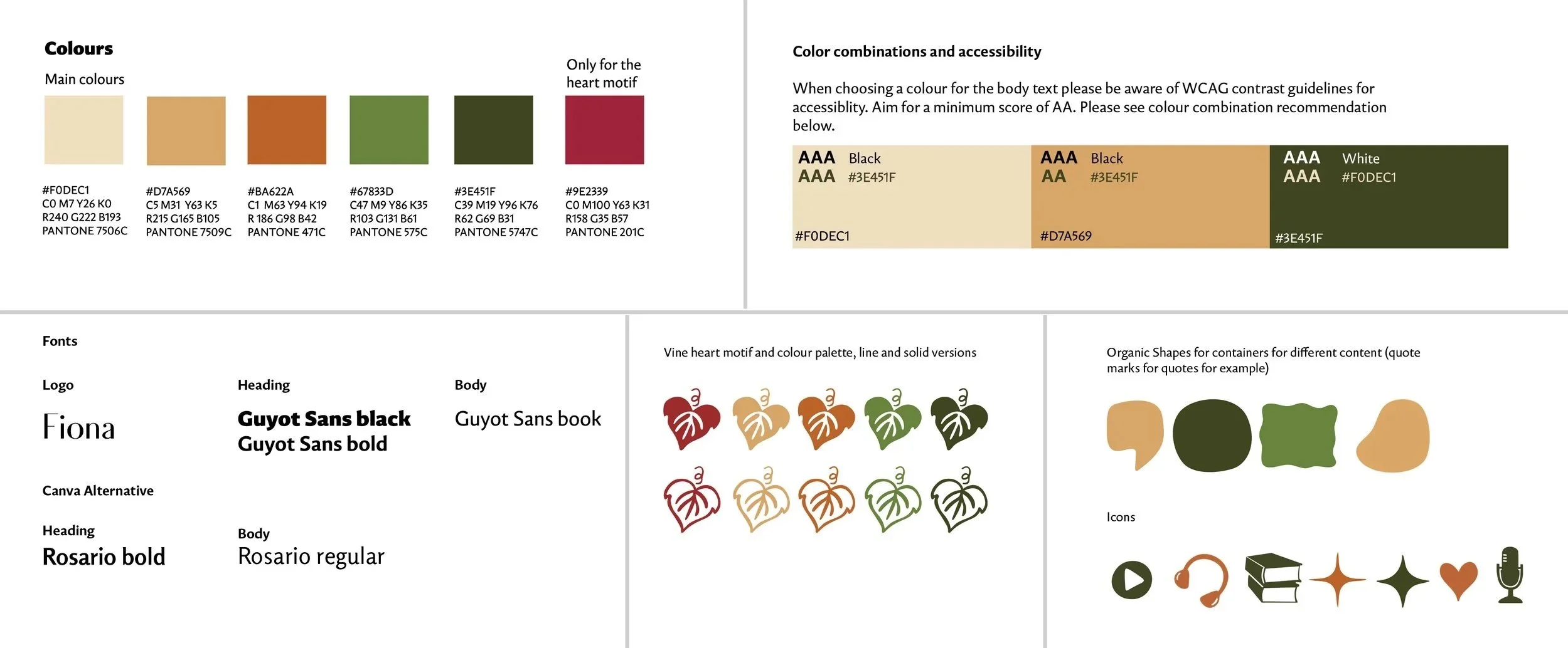
I have also developed graphics, icons and accessiblity guidelines as well as set up brand templates on Canva.
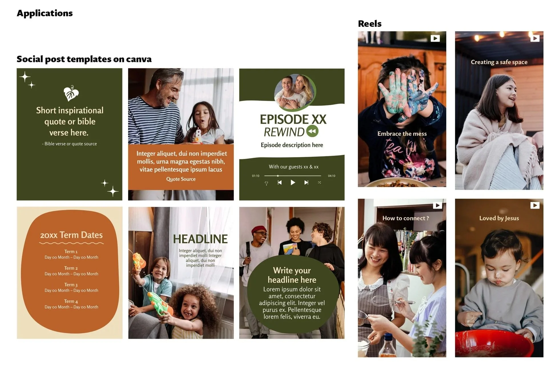
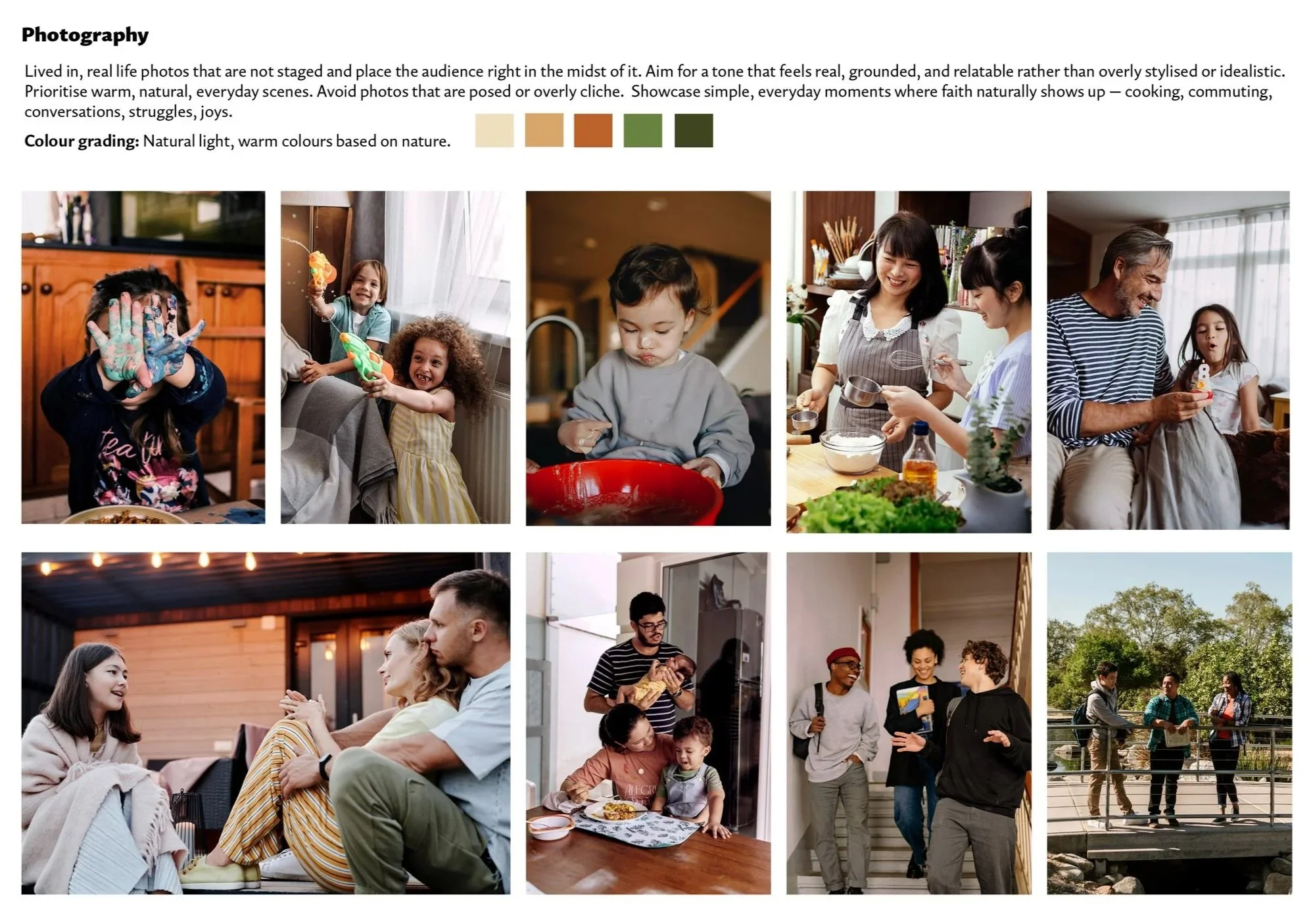
Photography selection and colour grading guidelines.