Role: Designer.
Tools: Illustrator, Photoshop.
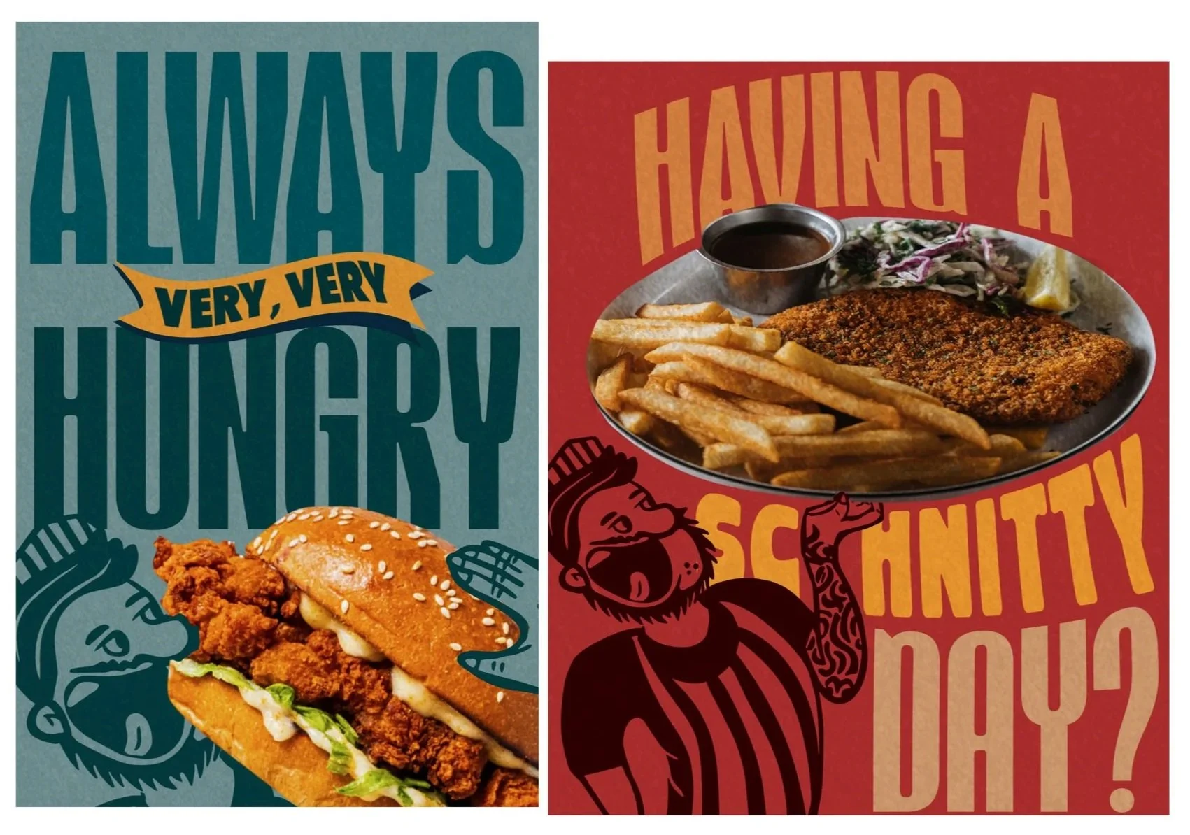
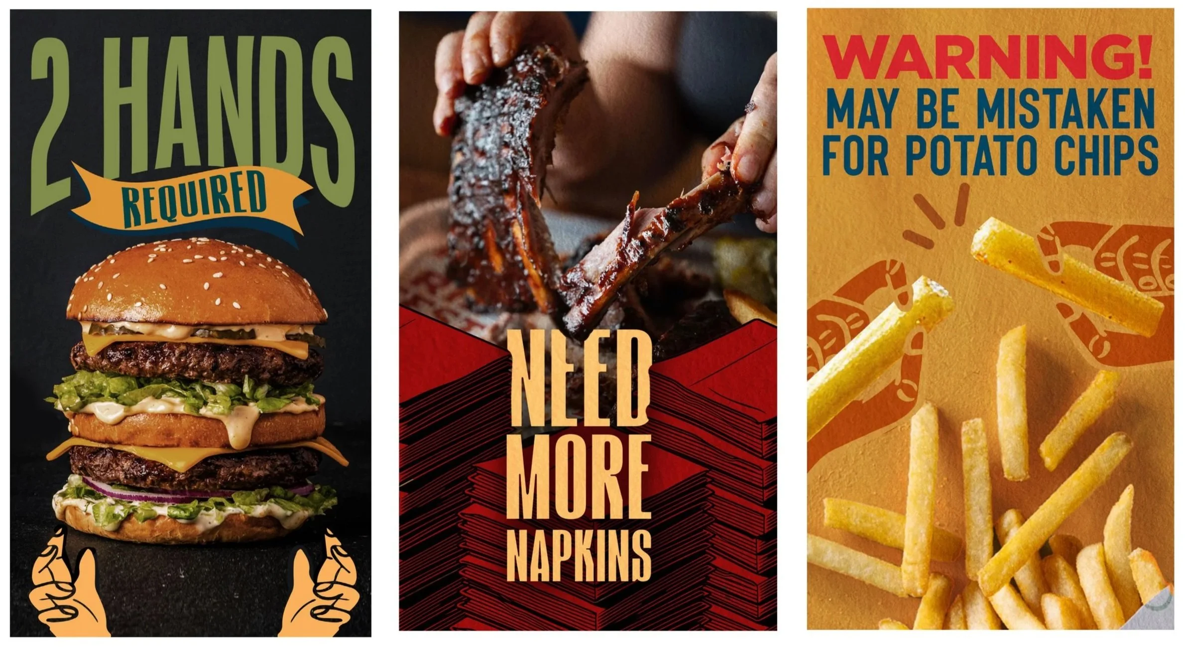
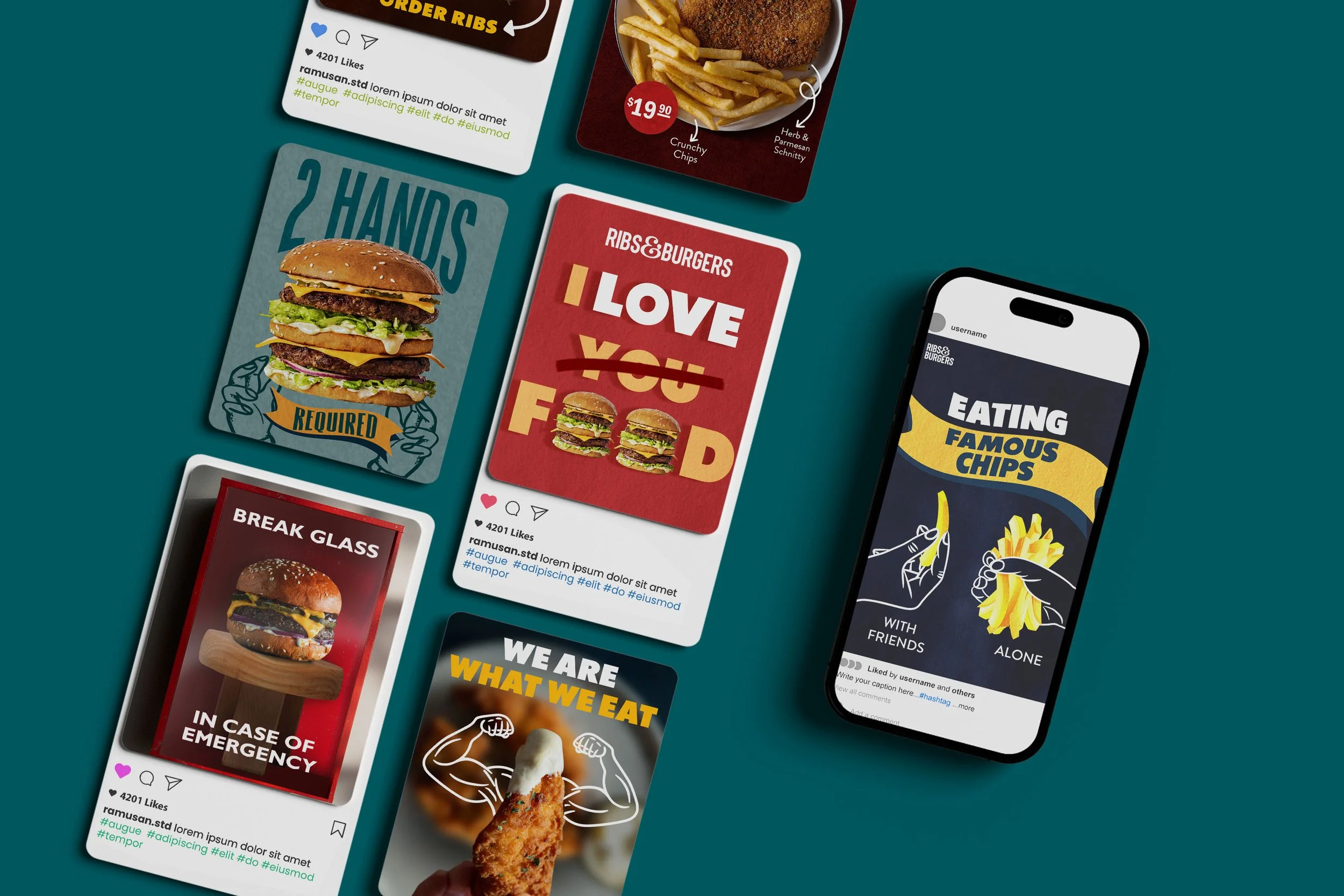
The Challenge: After launching a new menu built around generous portions, great value and a playful personality, in a category dominated by dark, moody aesthetics and straightforward food photography, the brand needed a social presence that actually stopped the scroll.
Solution: We threw out the industry playbook. Bold typography fills frames edge to edge, sometimes breaking right out of them. Single-colour illustrations are layered over hero food photography to exaggerate portion sizes to near-ridiculous effect, making the value proposition visible before anyone reads a word. The copy pulls its weight too: lines like "2 Hands Required" and "Need More Napkins" are short, witty, and let the audience do the thinking. The tone is warm, a little chaotic, and completely on-brand. The result is a social feed that feels nothing like the competition and exactly like the food: bold, generous, and a bit of a good time.