Role: Designer
Tools: Illustrator, Canva, Photoshop, Wordpress
The Challenge:Research shows that teachers often face demanding work pressures and feel undervalued. This contributes to burnt out and teachers leaving the profession which in turns create a shortage of educators in Australia. The ‘I Am a Teacher’ initiative by Pared Foundation aims to address this by creating a professional development program that is both practical and restorative. The logo needs to be designed to feel uplifting and inspiring, reflecting a program that not only equips teachers with skills, but also supports their wellbeing.

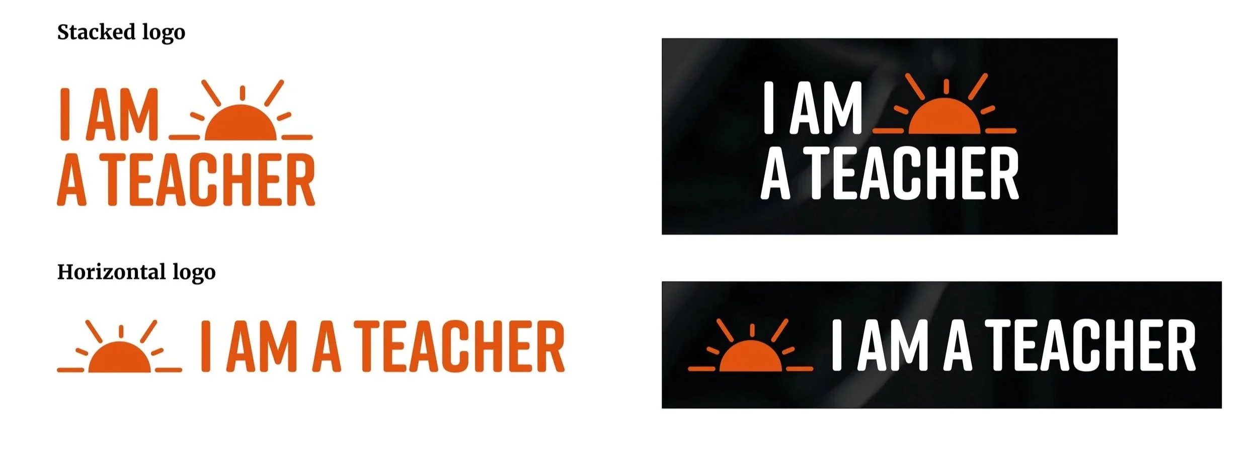
Final Logo

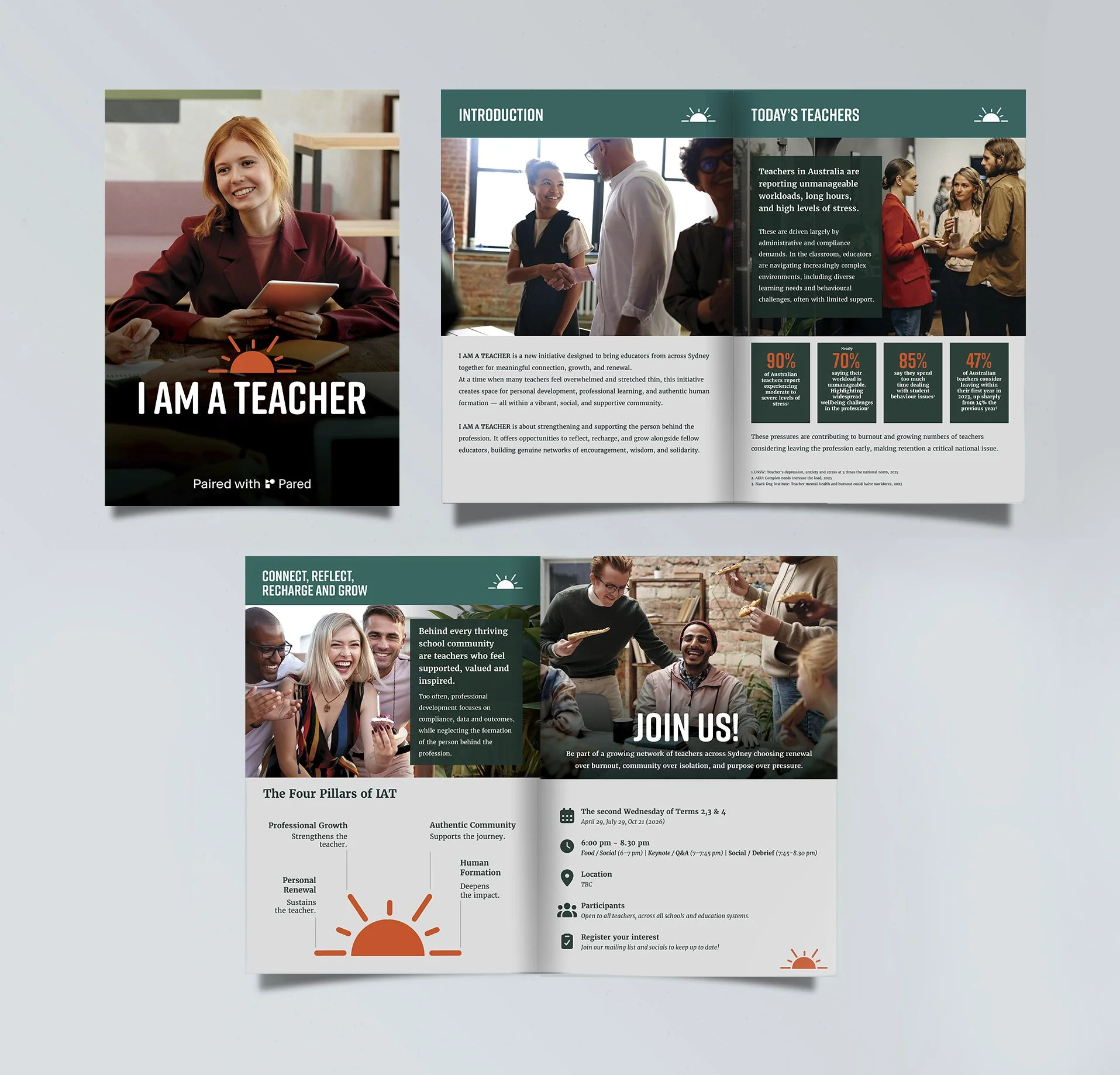
Infographics for Social Media
Conceptual and Design Process
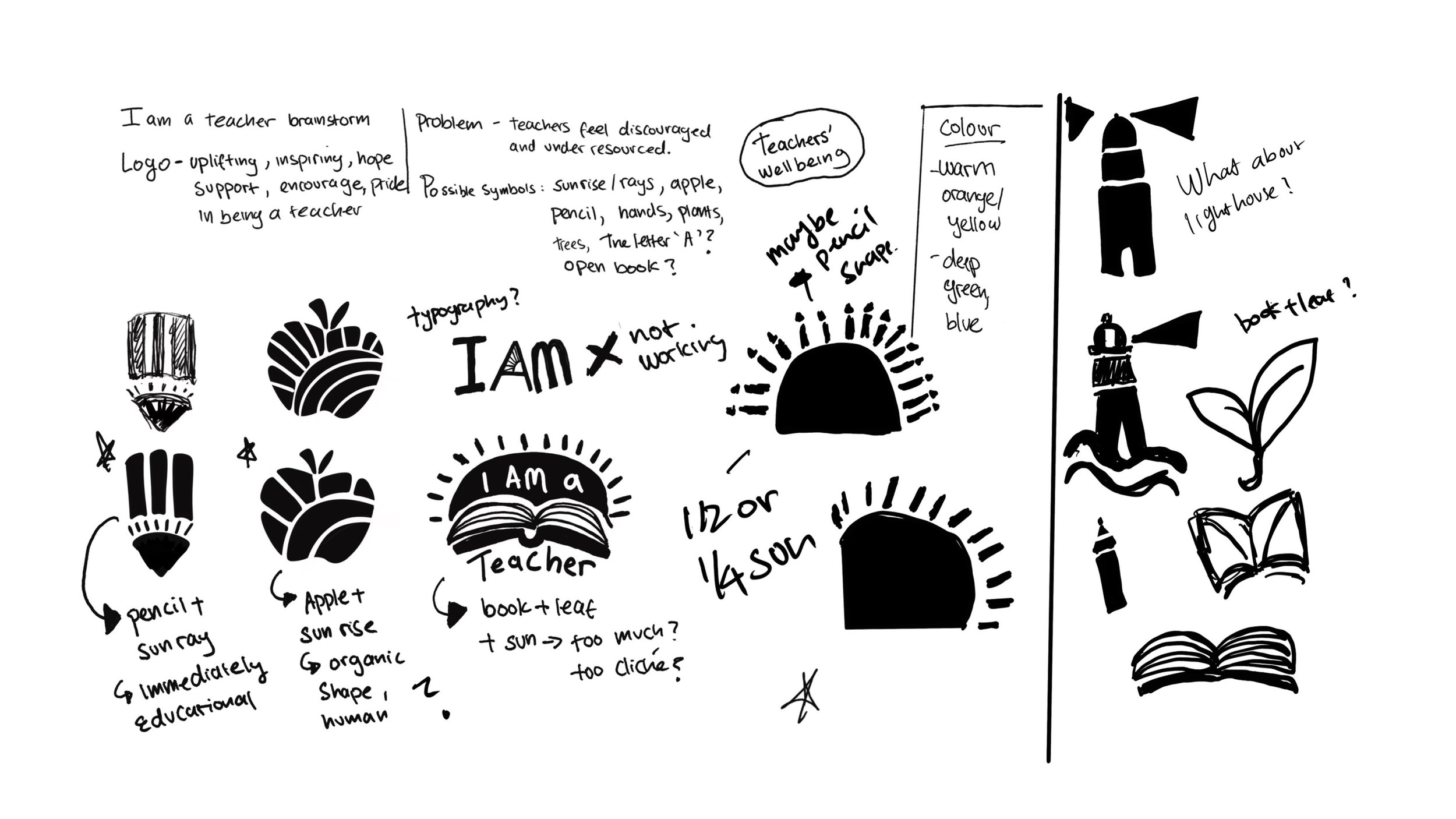
I started by playing around with widely recognised symbols of teaching and education such as books, apples and pencils as well as symbols of hope like sun rise, light houses and plants/nature. The aim is to move away from overly corporate and rigid ‘education’ branding and lean towards a more energetic, hopeful and inspiring logo that centers teachers and make them feel seen.
Proposed logo
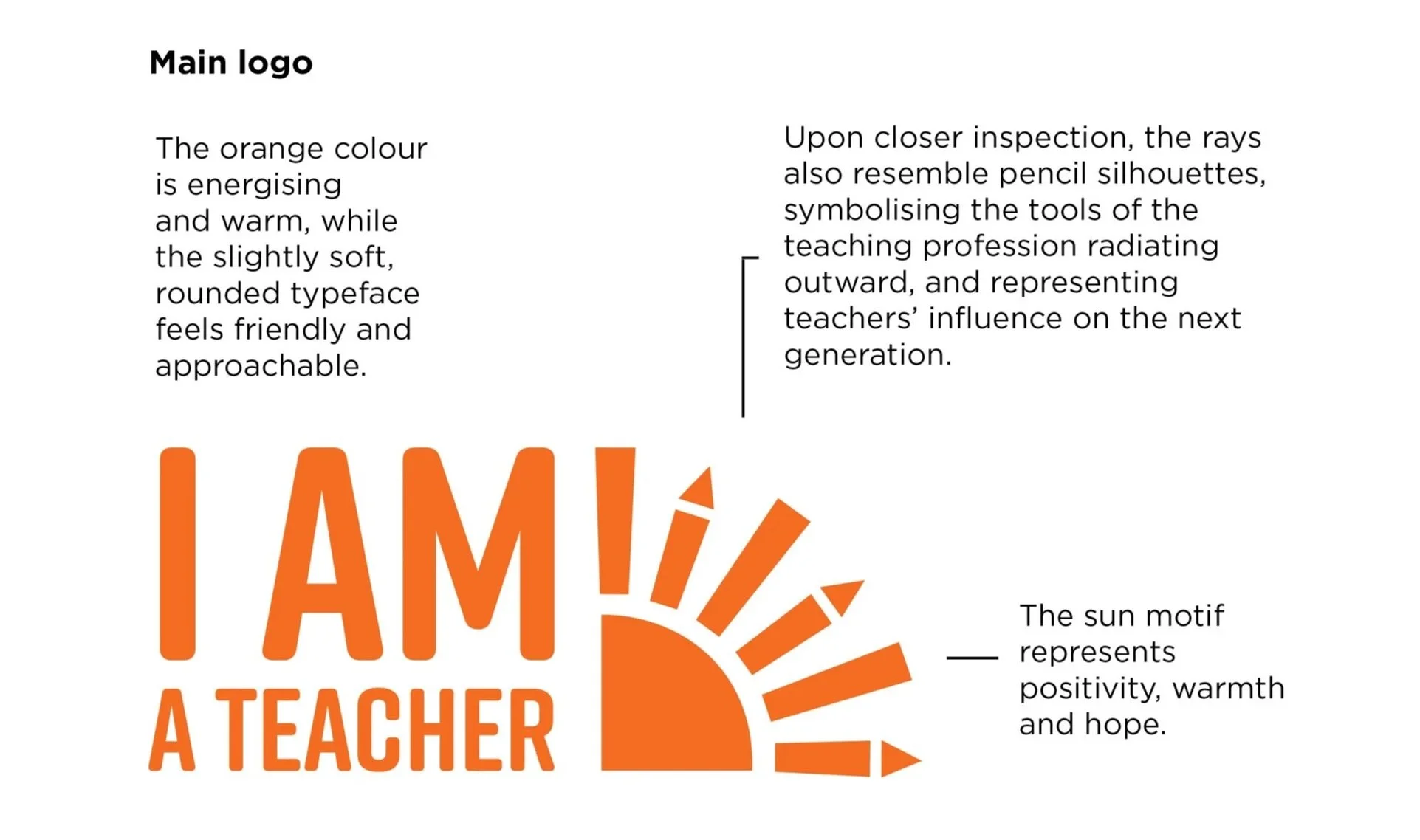
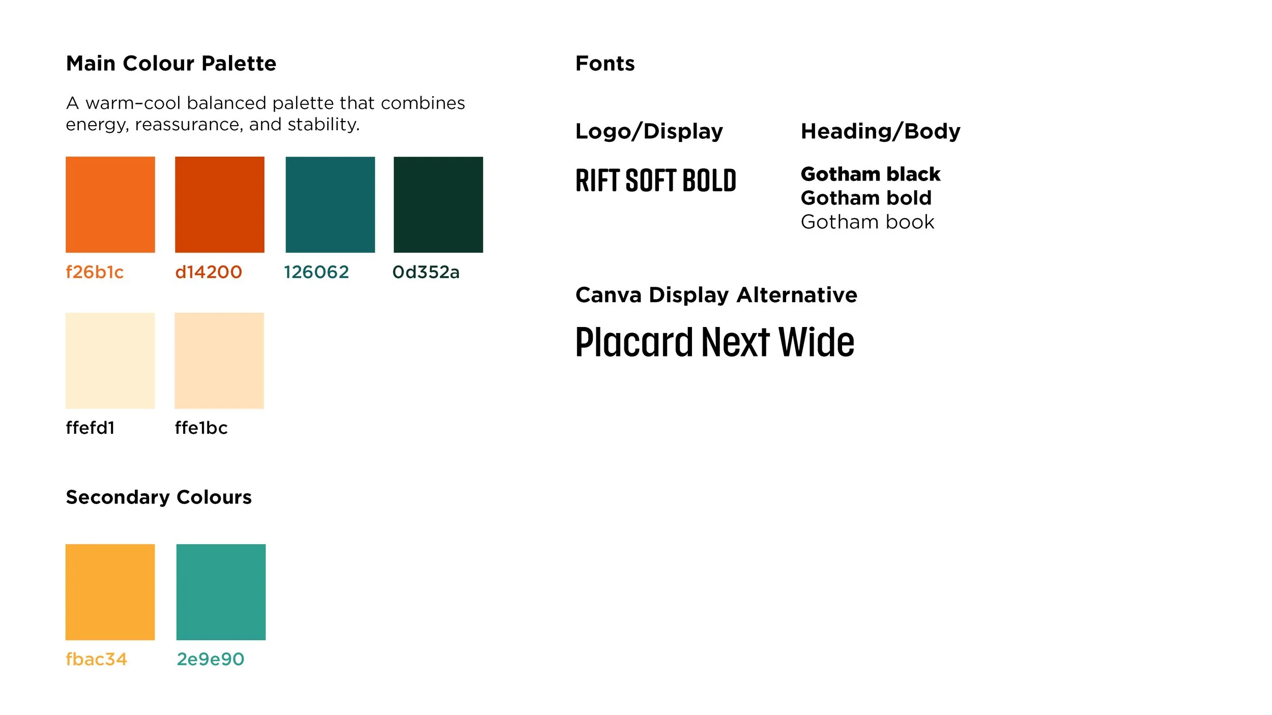
The proposed colour palette is developed from established colour psychology research. The rounded shapes of the typefaces reinforces warmth and friendliness.
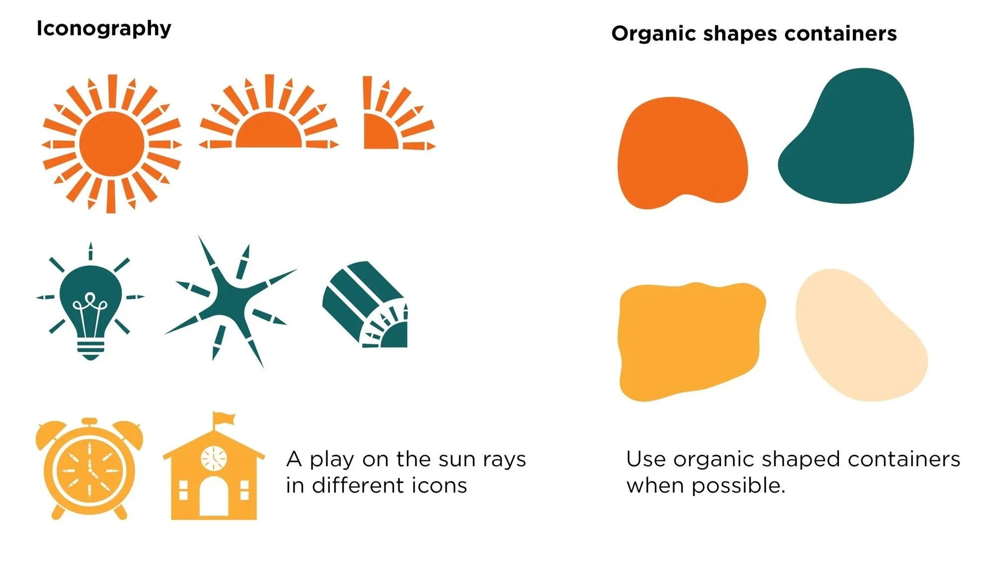
I also developed a series of iconography which incorporates the sun rays/pencil elements as well.
Feedback and revision.
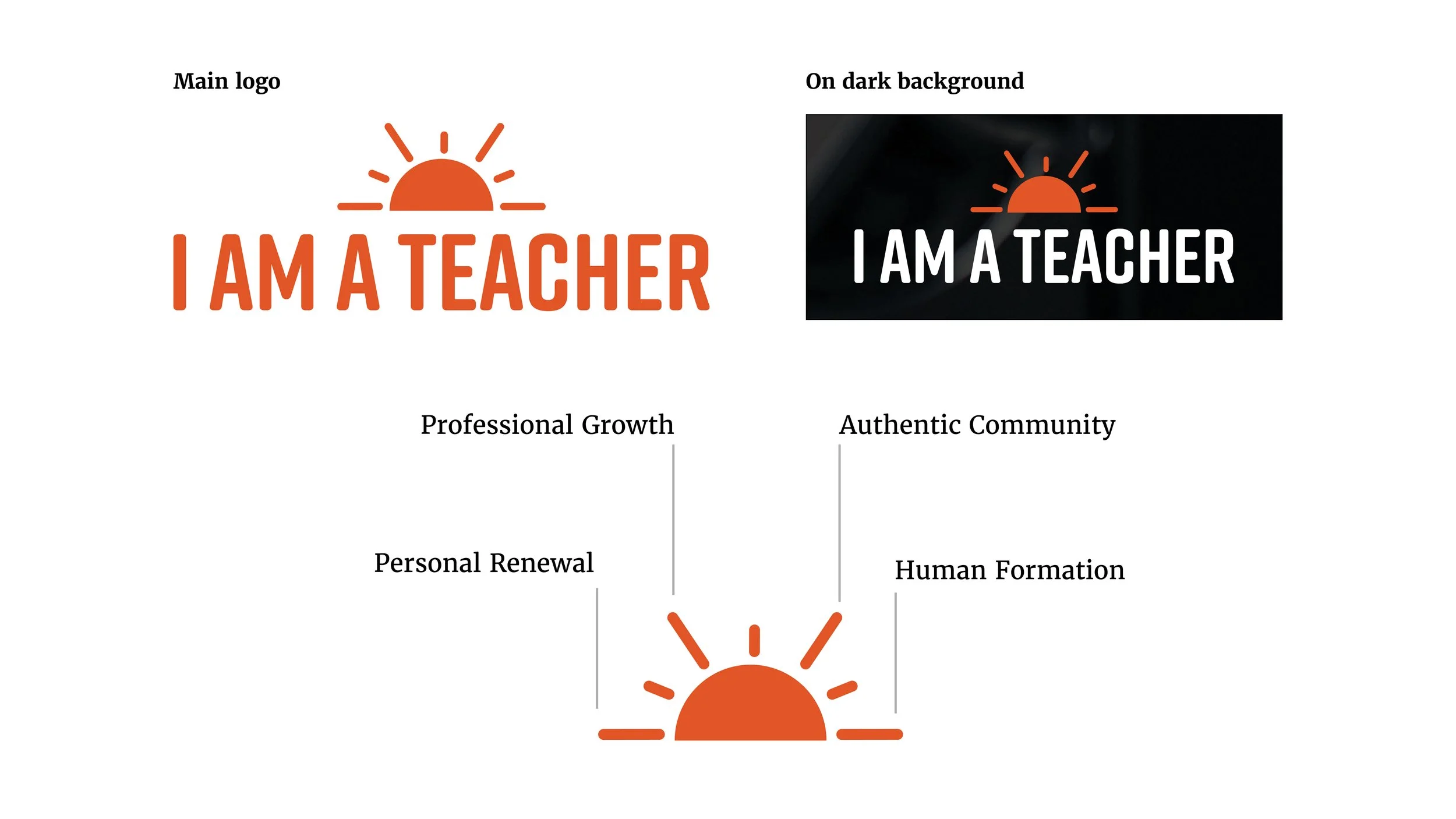
The team responded positively to the ‘sun’ concept, but felt the overall look could be more elevated and the logo simplified. They decided to move away from the pencil symbolism and supporting icons, as pencils can imply rigidity or correction. Instead, they wanted the design to focus on the four pillars of the program: Professional Growth, Authentic Community, Personal Renewal, and Human Formation. The goal was to create a more refined visual identity that would make teachers feel they are part of something meaningful and special.
In response, I developed a simplified half-sun mark with four long rays representing the four pillars. I also included three shorter rays as a subtle reference to the Trinity, acknowledging the Catholic foundation of the program. I also evolved the colour palette into a warmer variation to create a more professional and welcoming tone.
To keep the branding package simpler and more cohesive, the team decided to remove the iconography set.
Final Branding
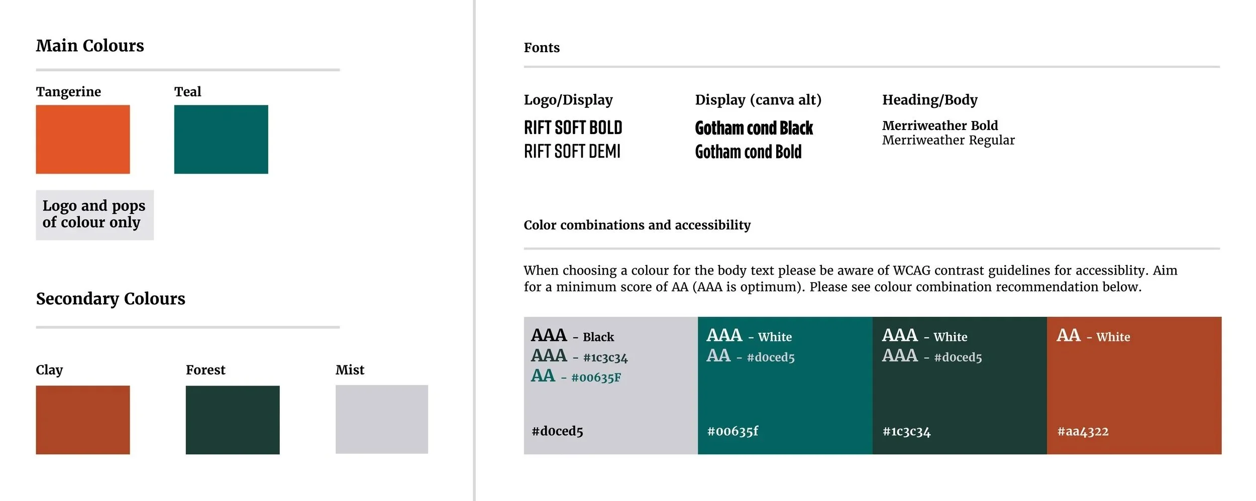
Colours, backgrounds & text guidelines
Manifesto